I was inspired to work on this project mainly because of my experience finishing school online. After 3 years of in-person classes, library and study room access, the entirety of my senior year classes were done online, and I was doing all my work from my house. While this was a great bonding experience for me and the people I lived with, it also made it very hard to maintain focus and productivity.
I was inspired to work on this project mainly because of my experience finishing school online. After 3 years of in-person classes, library and study room access, the entirety of my senior year classes were done online, and I was doing all my work from my house. While this was a great bonding experience for me and the people I lived with, it also made it very hard to maintain focus and productivity.
I was inspired to work on this project mainly because of my experience finishing school online. After 3 years of in-person classes, library and study room access, the entirety of my senior year classes were done online, and I was doing all my work from my house. While this was a great bonding experience for me and the people I lived with, it also made it very hard to maintain focus and productivity.
Of course I had my own personal insight into what helps me stay focused and productive, but my first step was to identify my target users and get an idea of their perspective, preferences, and motivations.
I wanted to design a solution that could encompass the needs of both students and working professionals. To begin, I interviewed a total of 8 participants comprised of high school students, college students, and corporate professionals, ranging from ages 18-55.
In terms of priorities for optimizing focus conditions, I identified 4 common themes across participant answers.
While brainstorming how I could combine these core values into my eventual solution, I did a miniature competitive analysis to determine where the market was at with productivity apps.
While brainstorming how I could combine these core values into my eventual solution, I did a miniature competitive analysis to determine where the market was at with productivity apps.
While brainstorming how I could combine these core values into my eventual solution, I did a miniature competitive analysis to determine where the market was at with productivity apps.
Some of the platforms I looked at included Notion, Trello, and online Pomodoro timers. Notion and Trello are popular platforms for managing tasks, but don't incorporate any of the other core values. Simple online Pomodoro timers only facilitated breaks for focus times.
Some of the platforms I looked at included Notion, Trello, and online Pomodoro timers. Notion and Trello are popular platforms for managing tasks, but don't incorporate any of the other core values. Simple online Pomodoro timers only facilitated breaks for focus times.
Some of the platforms I looked at included Notion, Trello, and online Pomodoro timers. Notion and Trello are popular platforms for managing tasks, but don't incorporate any of the other core values. Simple online Pomodoro timers only facilitated breaks for focus times.
Mobile app with companion lamp that allows users to set their ideal focus settings
- Light
- Pomodoro timer
- Synchronized focus sounds/music
- Color chat feature
Mobile app with companion lamp that allows users to set their ideal focus settings
- Light
- Pomodoro timer
- Synchronized focus sounds/music
- Color chat feature
Mobile app with companion lamp that allows users to set their ideal focus settings
- Light
- Pomodoro timer
- Synchronized focus sounds/music
- Color chat feature
Determining the Core Functions
Determining the Core Functions
Determining the Core Functions
To get a sense of how I wanted to incorporate all these features, I made a storyboard envisioning the headspace of a potential user. This helped me narrow in on key screens and map the user journey.
To get a sense of how I wanted to incorporate all these features, I made a storyboard envisioning the headspace of a potential user. This helped me narrow in on key screens and map the user journey.
To get a sense of how I wanted to incorporate all these features, I made a storyboard envisioning the headspace of a potential user. This helped me narrow in on key screens and map the user journey.
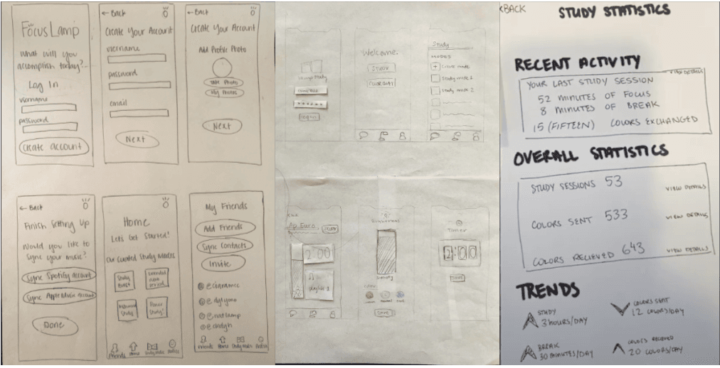
From there, I was able to begin preliminary sketches for the app's core screens.
From there, I was able to begin preliminary sketches for the app's core screens.
From there, I was able to begin preliminary sketches for the app's core screens.
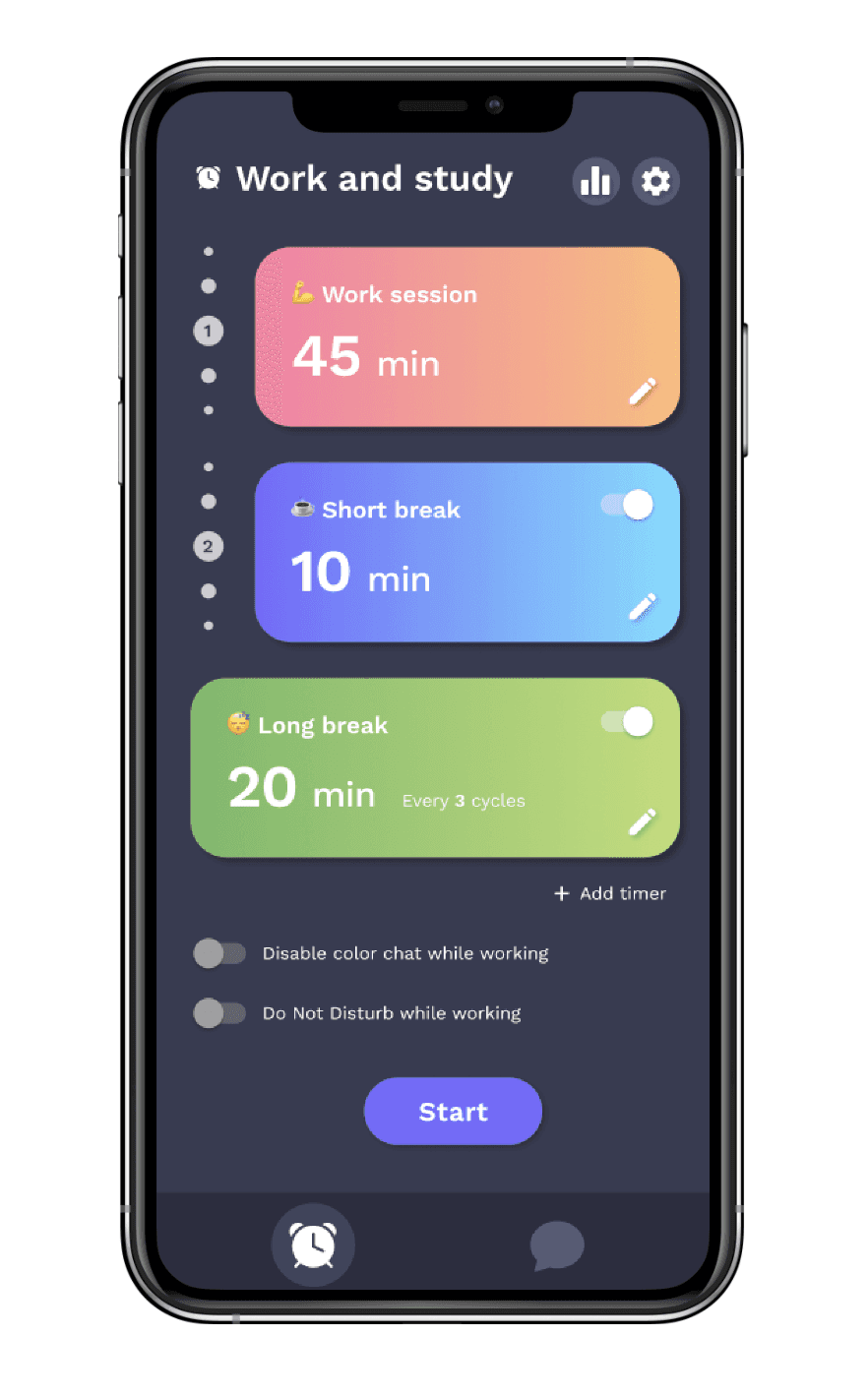
Core screens include onboarding and account setup, home screen, working stats, and "Glow Mode" setup, which includes adjusting lamp color & brightness, timer, and sound settings.
Core screens include onboarding and account setup, home screen, working stats, and "Glow Mode" setup, which includes adjusting lamp color & brightness, timer, and sound settings.
Core screens include onboarding and account setup, home screen, working stats, and "Glow Mode" setup, which includes adjusting lamp color & brightness, timer, and sound settings.
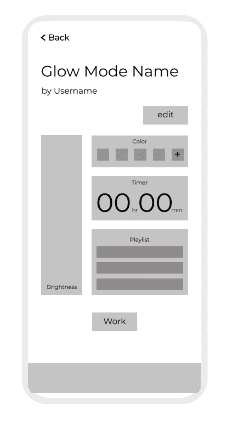
Combined light, timer, and sound settings for a designated session. This is really the heart of the app.
Low-fidelity and mid-fidelity designs. User feedback indicated color settings and music would likely be lesser-used features, as they would most frequently want yellow/white light and could just play their music separately.
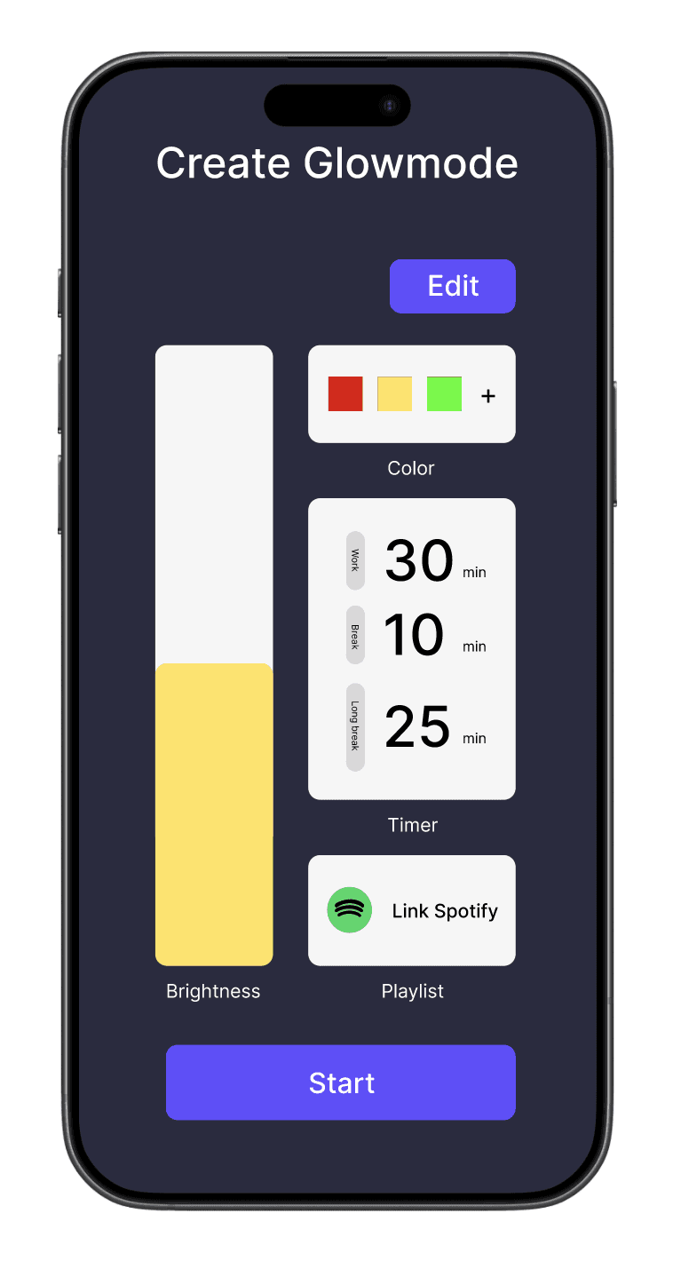
Streamlined version of set-up design to reduce cognitive load and prioritize key features. Color options were eliminated, and this version prioritizes the Pomodoro timer as the core function of the app.
Default display for saved workflows and pending color chats, where I initially intended to have users store their Glowmodes and view pending color chats.
Original vision for home page, with recently used Glowmodes at the top, pending color chats from friends, and pre-made community Glowmodes at the bottom. Users seemed to have trouble understanding exactly what Glowmodes were and didn't feel the need for so many options. They felt that exploring options would just take up unnecessary time as they were getting ready to start working.
Design feedback led me to completely eliminate the home page and rethink what the core screens even were. At this point I referred back to the insights I gathered during my research to remind myself why I was designing WorkGlow.
I came to realize that having all these configuration options was just causing a distraction and working against the integrity of the app. Rather than helping users stay focused and boost their productivity, I was distracting them with unnecessary features.
In particular, I thought back to the 4 core values I identified, and the only one not represented in the design was task management.
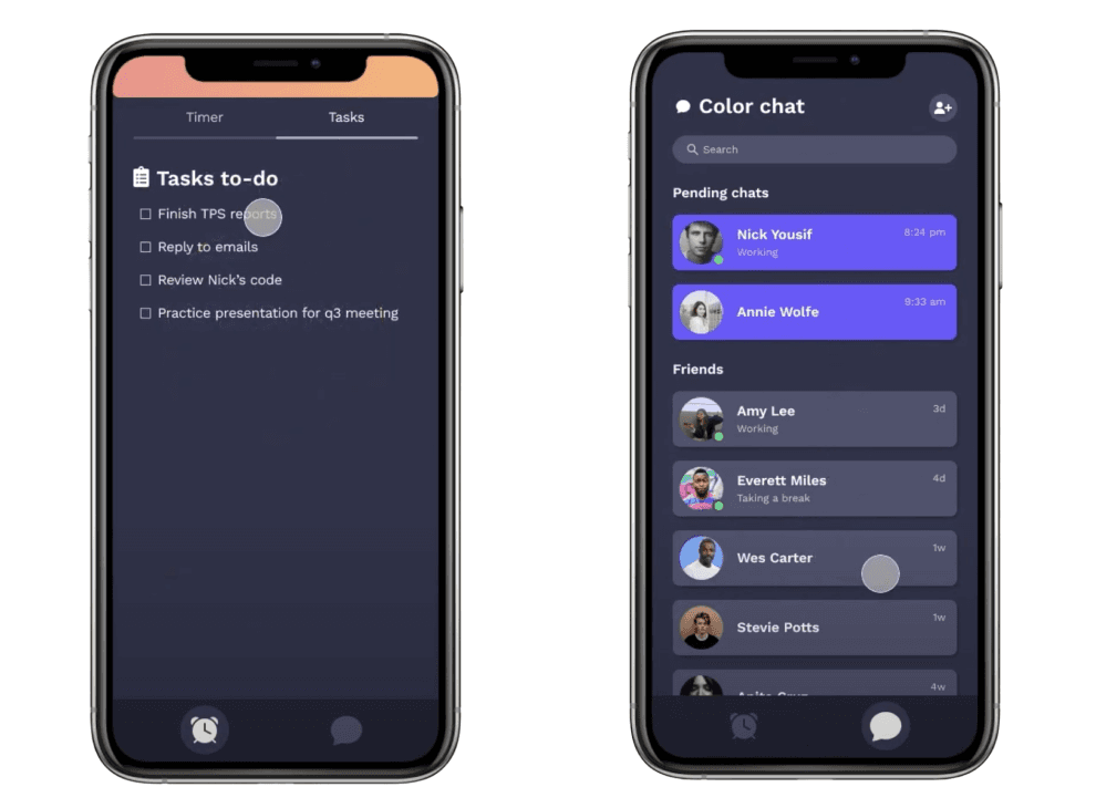
Instead of redesigning the home page, I opted to make the home screen a dual timer set up and task management screen. Users can keep track of tasks they're working on during each individual working session by toggling back and forth between those two tabs. I also trimmed down the navigation by making the only two main screens the timer and color chats.