ROLE
UX Researcher & Designer


University of Chicago Polsky Center is a professional development hub that supports entrepreneurial technology projects by partnering with investors, project partners, and project creators. The Polsky Center website plays a major role in outreach and communication of these technologies with industry professionals. Overall goal is to form a partnership with collaborators, fund their research and product inventions, and eventually have companies license patents to their intellectual property all through the process of technology transfer.
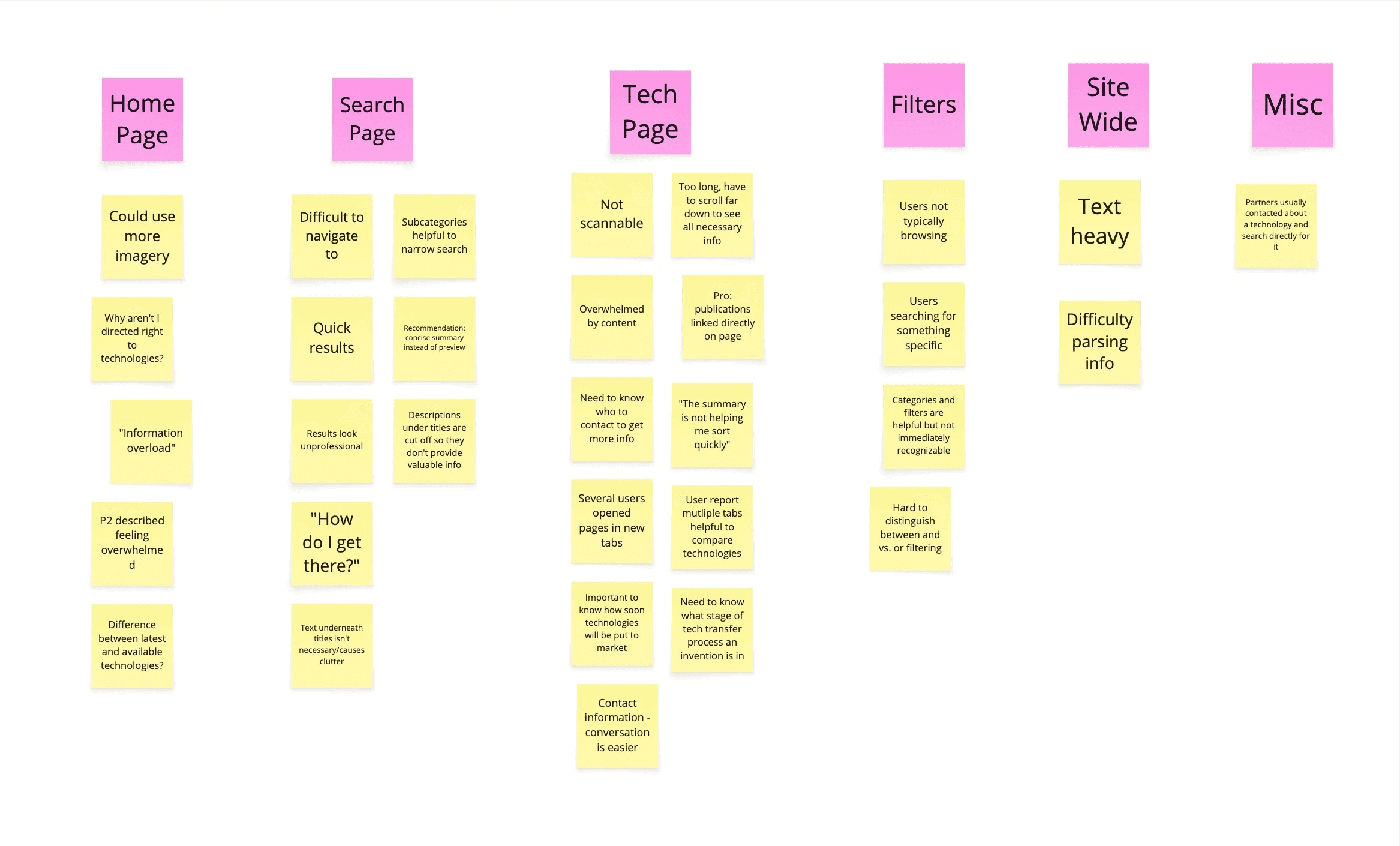
The main issues faced by the Polsky Center for their website redesign were determining how to facilitate website navigation and how to improve the discoverability of key elements within the site. The task was to evaluate and redesign 3 core screens of the Polsky Center website: technology publisher home page, search page, and technology detail page.
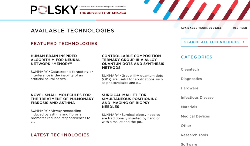
Home Page

Search Page
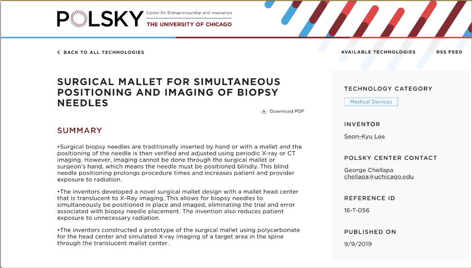
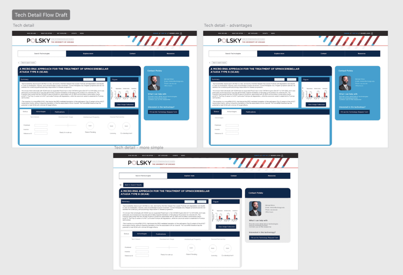
Technology Detail Page
Performed a heuristic evaluation, competitive analysis, and interviewed industry partners to better understand the problem and define our UX requirements.
Brainstorming and design planning, followed by high fidelity designs.
Usability testing on design concepts with users and corresponding design changes.
Developed implementation plan with the client and shared final design materials with interactive prototype included.


During these brainstorming sessions, the design team made the decision to combine the Home Page and Search Page into one overarching search page. From screen, our new design would offer a navigation tab to allow users to alternate between core functions: Search Technologies, Explore More, Contact, and Resources.

We also settled on a dashboard format for the Technology Detail page due to research and usability testing showing that the current site was far too text heavy and difficult for users to parse important information.


Feedback: Somewhat difficult to understand which content is grouped together on grid card results
Action: Added drop shadow and spacing across cards to increase distinction across information groups
Feedback: Images do not have caption describing what the image is and why it’s important to users
Action: Provide captions when user selects view image in full screen
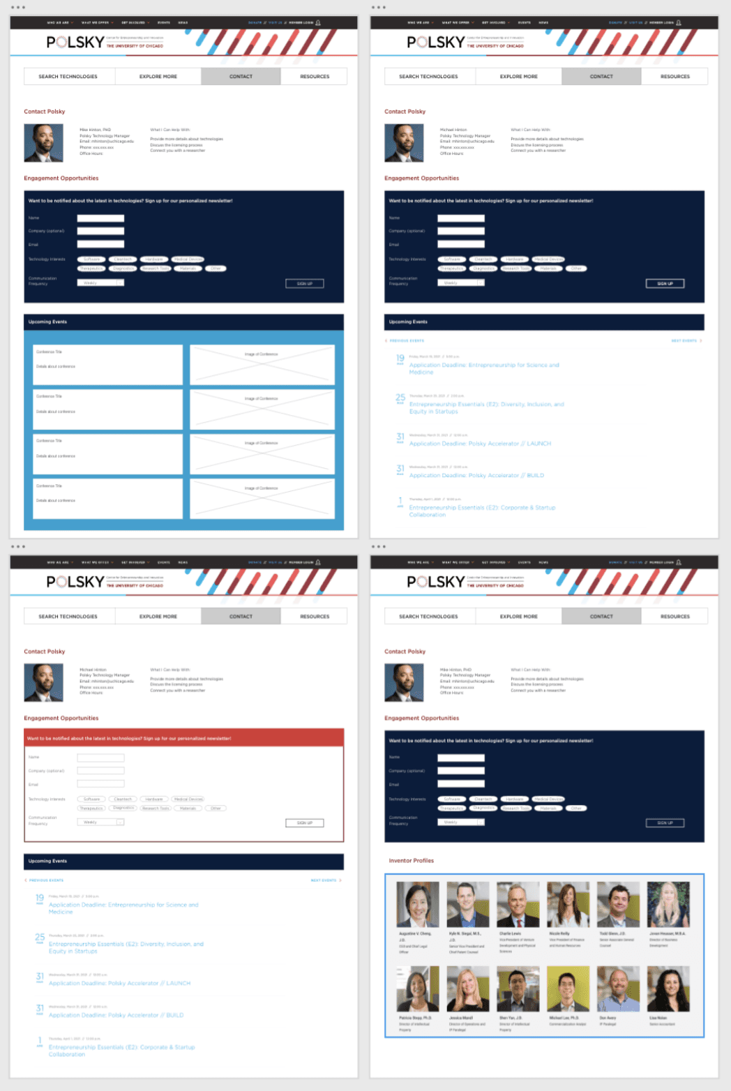
Feedback: Newsletter signup being mistaken for a contact form
Action: Change the header color to be more consistent with the rest of the page and use a more clear header to describe the form
Begin by clicking "Available Technologies" in the upper right corner. Navigate to the "Search Technologies" tab and apply the "Therapeutics" filter to test filtering results. Then click into the first card to get a view of the Technology Details Page.
Improved value of home page by directing users to search and reducing their required number of clicks.
Improved appearance of technology details by effectively synthesizing and grouping information for easy scanning.
Improved opportunities for community outreach by more clearly providing access to points of contact.
We were limited in how frequently we were able to get access to participants for user testing, so we saved the industry partners for validation testing and used feedback from design critiques and client meetings for iterations throughout the design process.